App screen templates designed for the phone.
These are mobile editions, not websites squeezed into a narrow column. Tap targets, tab bars and spacing are drawn for the device, and every screen in a kit shares one system so the app holds together as you add to it.
Mobile app templates in the marketplace
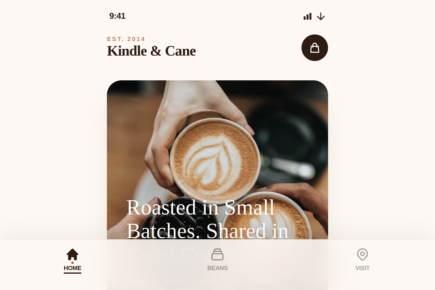
Kindle & Cane | Artisanal Small-Batch Coffee Roasters
$63 pages · Mobile
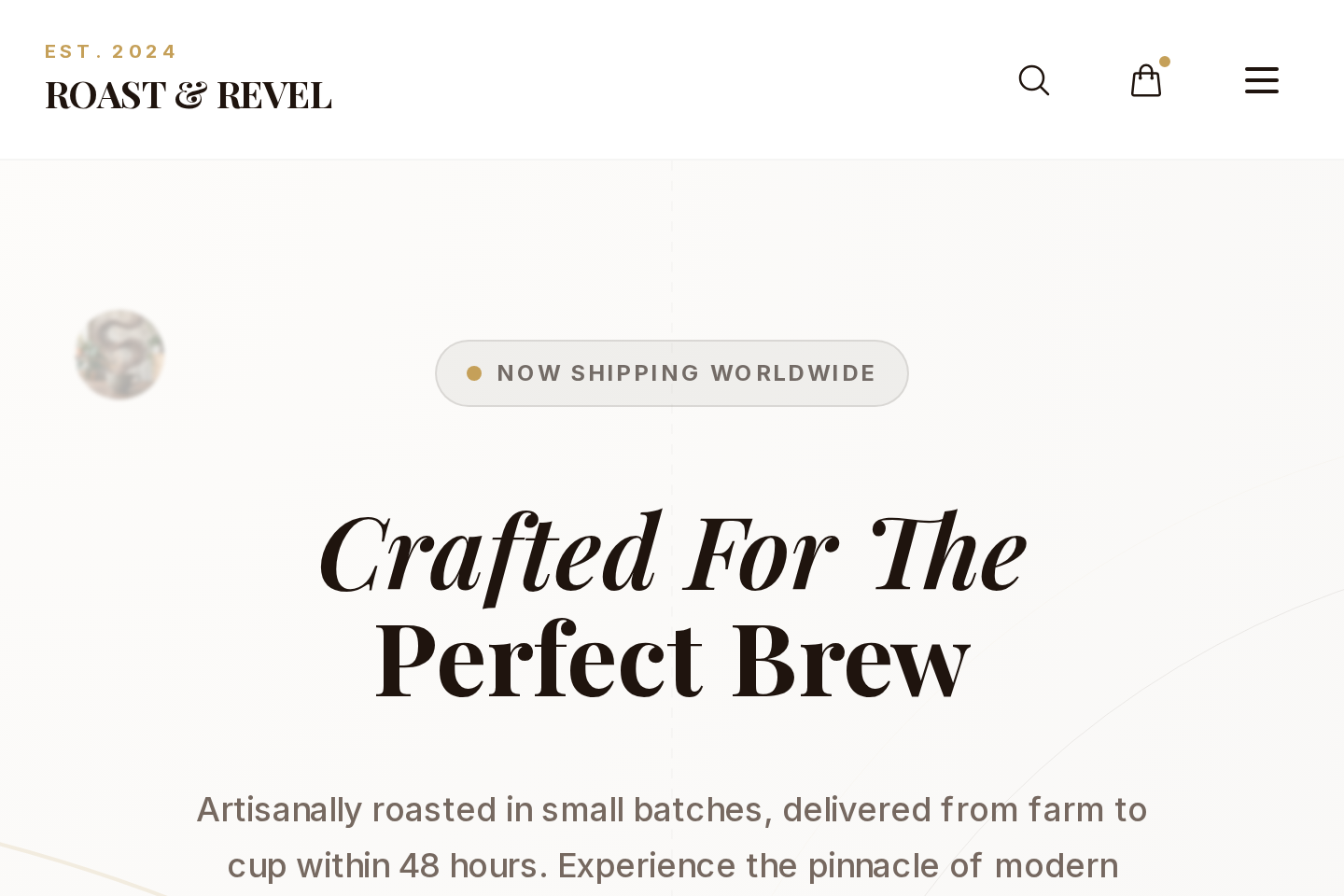
Roast & Revel — Crafted For The Perfect Brew
$63 pages · Mobile
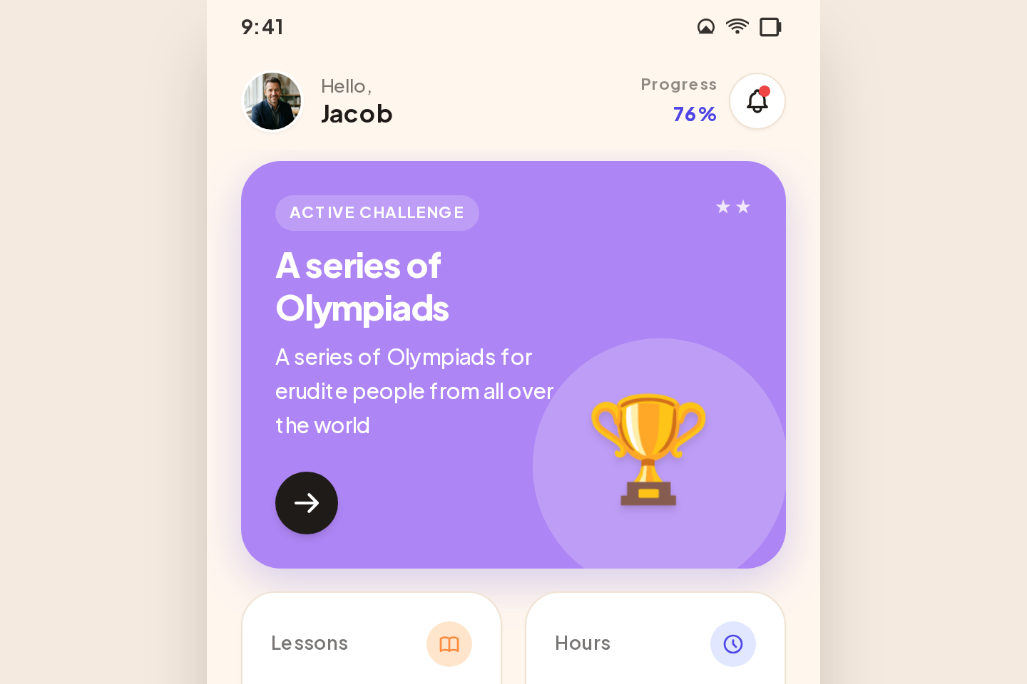
Schola — Dashboard
$4.973 pages · Mobile
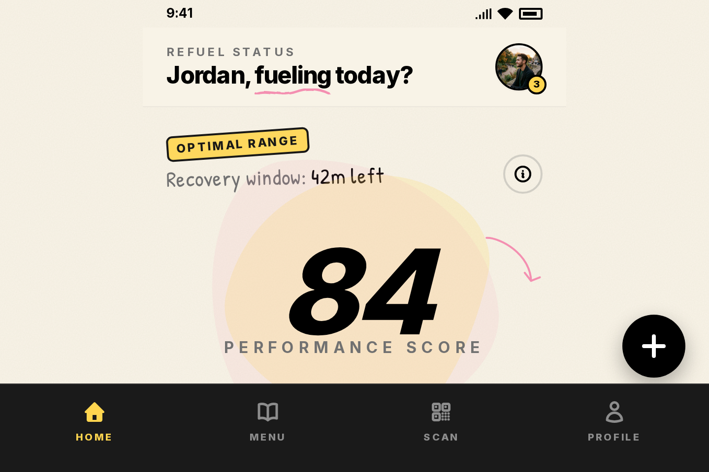
IRON & OAK — DASHBOARD
$64 pages · Mobile
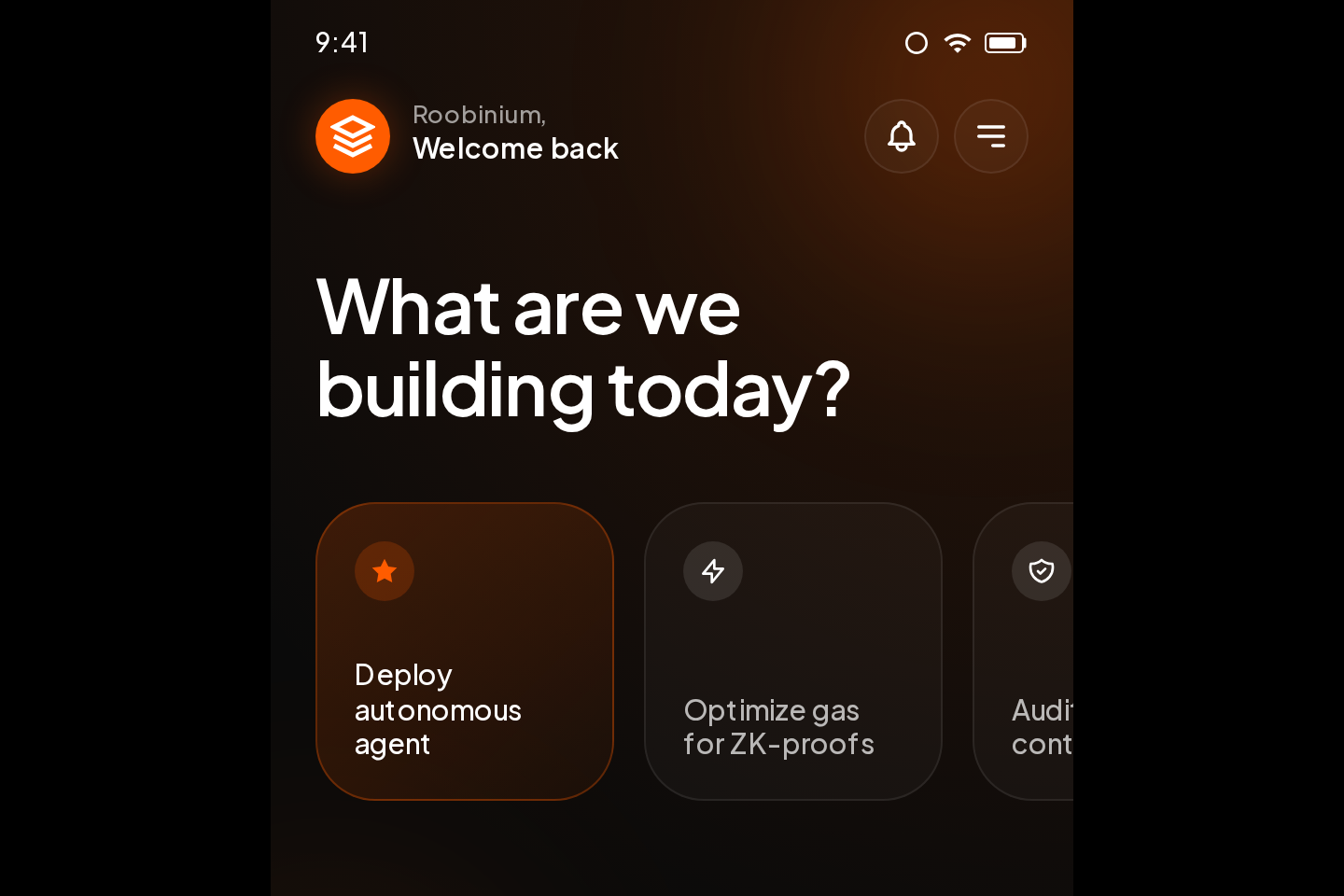
Roobinium — Home
$63 pages · Mobile
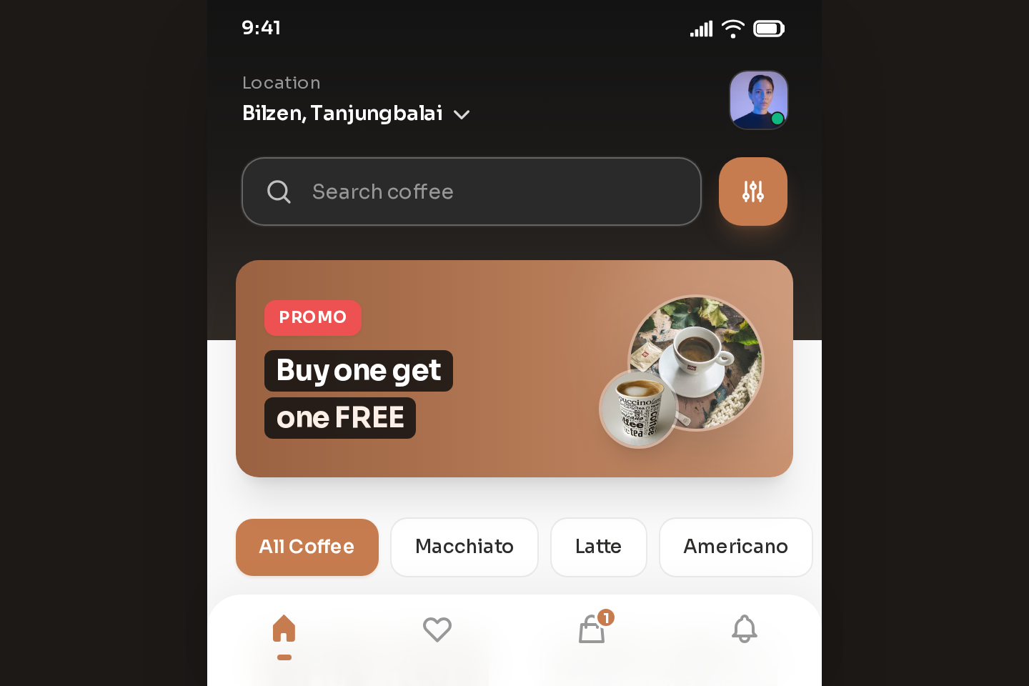
Kaffa Cafe — Craft Coffee & Delivery
Free6 pages · Mobile
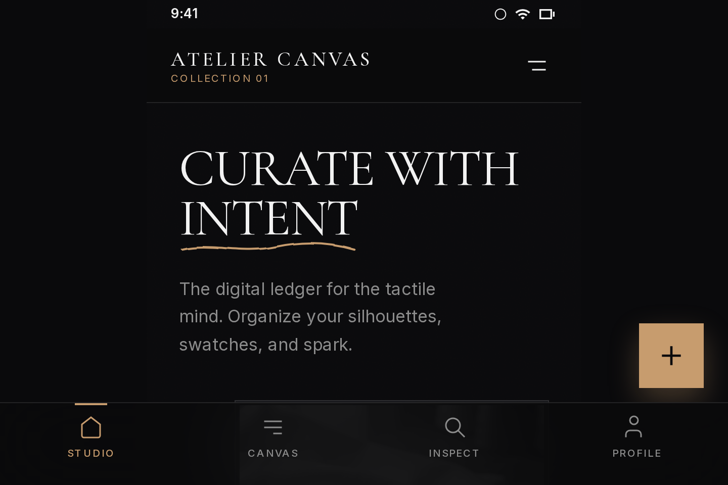
Atelier Canvas — The Digital Ledger for Tactile Minds
$6.994 pages · Mobile
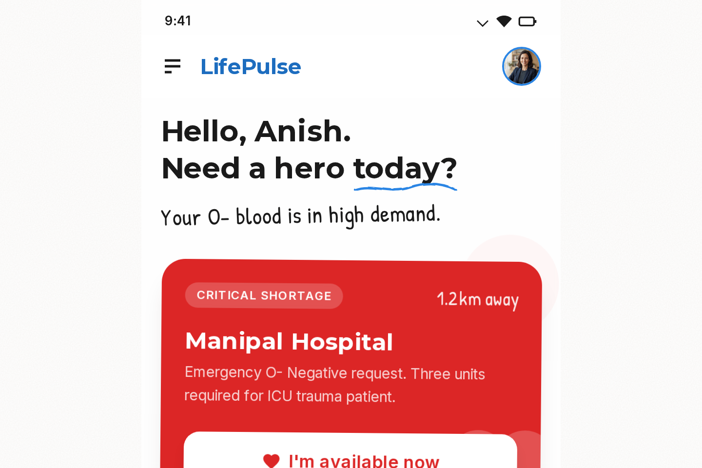
LifePulse Dashboard
Free4 pages · Mobile
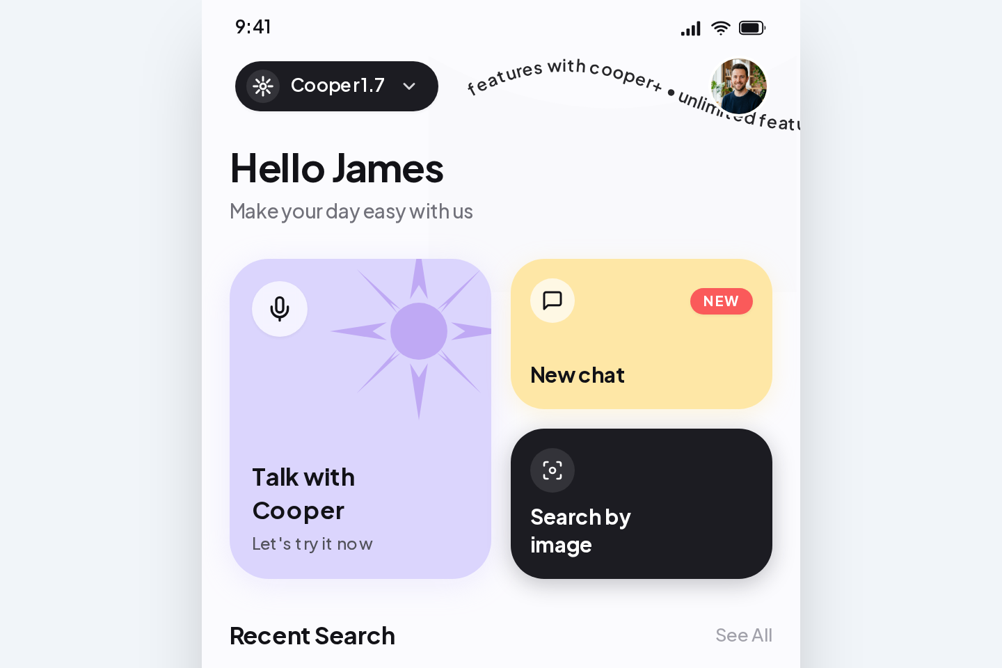
Cooper AI — Home
Free3 pages · Mobile
What a good mobile app template needs
The checklist every template in this category is built against — useful whether you buy one here or build your own.
The screens an app actually needs
Onboarding, home, detail, search, profile and settings — the flow, not one hero screen in isolation.
Thumb-reachable actions
Primary actions sit in the lower third where a thumb naturally lands.
One system across the flow
Type scale, spacing and components shared by every screen, so screen twelve matches screen one.
Handoff without a redraw
Take the screens out as Tailwind HTML, PNG or PDF, so whoever builds the app works from the real design rather than a redrawn copy of it.
Common questions.3 answers, each complete on its own.
Still stuck? Write to support@kriyaxlabs.com and a person answers.
Tailwind HTML, PNG or PDF. SketchXFlow produces the design, not native app code — if you want the app itself built, SketchXFlow Services builds it in Flutter or React Native at a fixed price.
Real app screens. Mobile is a separate edition in SketchXFlow, composed for the phone form factor rather than derived from a desktop layout.
Yes. Describe the screen you need and it is composed in the same design system as the rest of the kit, with matching navigation and states.